
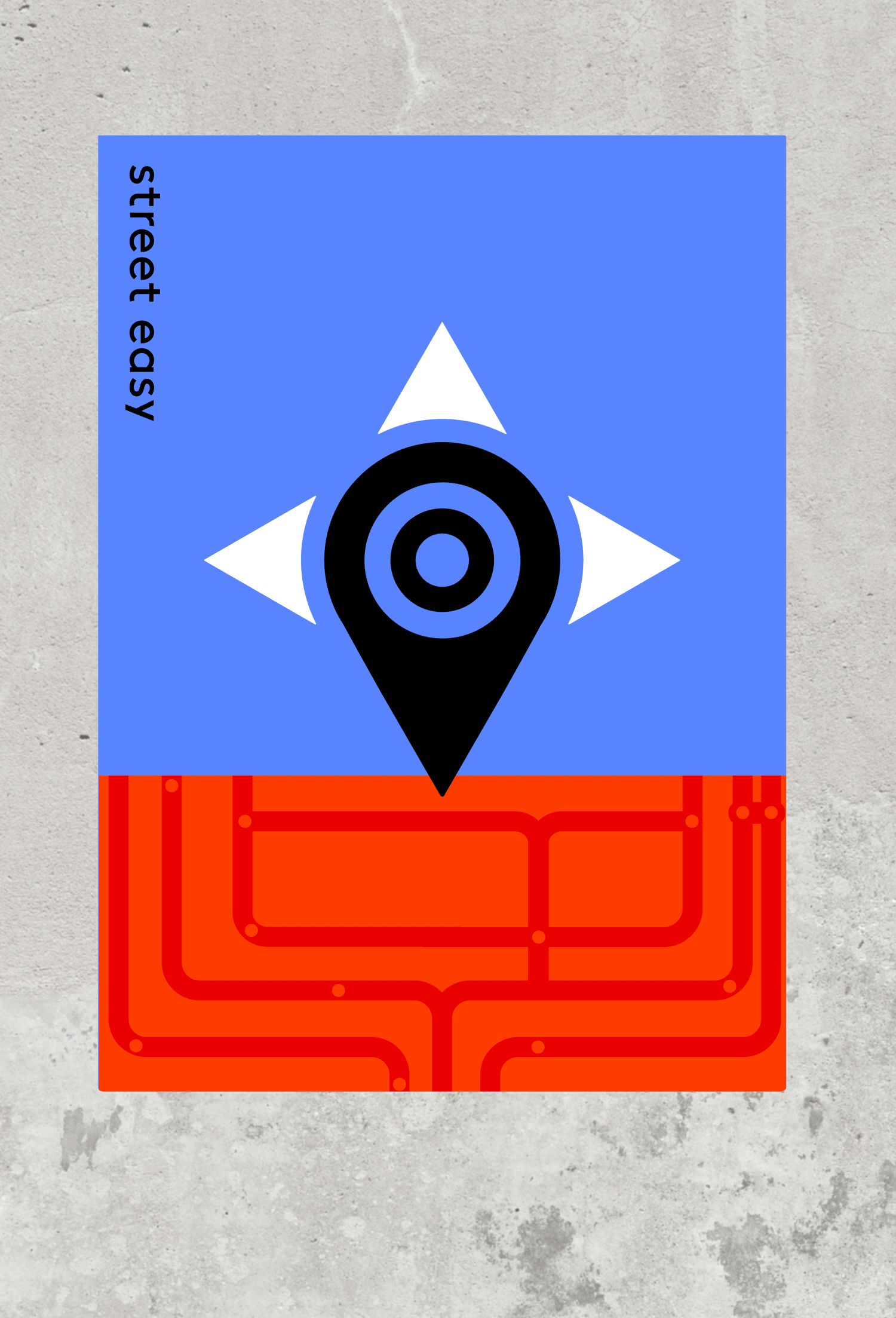


Proposed re-brand for Street Easy. The mark represents the brand as a utility for finding the dream apartment. The location pin is the core, with complementary graphic elements to depict a compass and a human eye. The branding also included graphic abstractions of city street grids—-the shapes and style are reflected in the web design explorations.